CSS Layout
Add CSS
External CSS
<!DOCTYPE html>
<html>
<head>
<link rel="stylesheet" type="text/css" href="mystyle.css">
</head>
<body>

<h1>This is a heading</h1>
<p>This is a paragraph.</p>

</body>
</html>
Internal CSS
<!DOCTYPE html>
<html>
<head>
<style>
body {
  background-color: linen;
}

h1 {
  color: maroon;
  margin-left: 40px;
}
</style>
</head>
<body>

<h1>This is a heading</h1>
<p>This is a paragraph.</p>

</body>
</html>
Inline CSS
<!DOCTYPE html>
<html>
<body>

<h1 style="color:blue;text-align:center;">This is a heading</h1>
<p style="color:red;">This is a paragraph.</p>

</body>
</html>
CSS Layout
如果希望实现下面的布局,可以使用不同的方法实现:
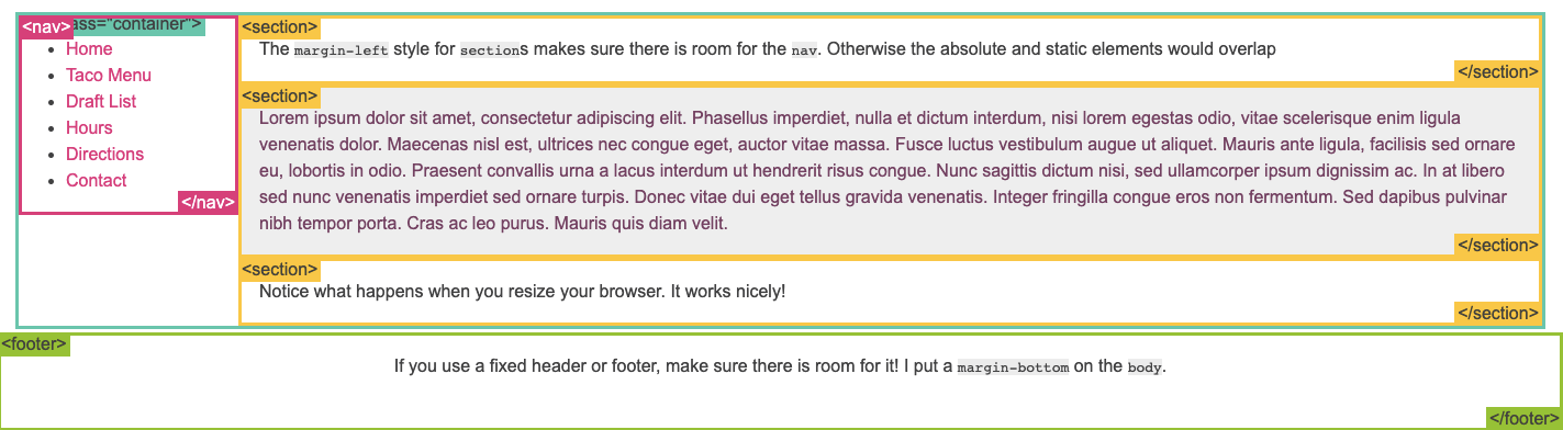
1. position example
.container {
  position: relative;
}
nav {
  position: absolute;
  left: 0px;
  width: 200px;
}
section {
  /* position is static by default */
  margin-left: 200px;
}
footer {
  position: fixed;
  bottom: 0;
  left: 0;
  height: 70px;
  background-color: white;
  width: 100%;
}
body {
  margin-bottom: 120px;
}
2. float example
Float is intended for wrapping text around images
nav {
  float: left;
  width: 200px;
}
section {
  margin-left: 200px;
}
3. inline block example
nav {
  display: inline-block;
  vertical-align: top;
  width: 25%;
}
.column {
  display: inline-block;
  vertical-align: top;
  width: 75%;
}
4. flexbox example
.container {
  display: -webkit-flex;
  display: flex;
}
nav {
  width: 200px;
}
.flex-column {
  -webkit-flex: 1;
          flex: 1;
}
要点
-
displayproperty:display属性可以是block(div是典型的block元素),inline(span是典型的inline元素),none(script的none元素,和visibility:hidden不同,none类型的元素会在渲染阶段当作该元素不存在,但是如果只是hidden,该元素仍然会占有和原来一样的位置)。更多介绍见这里。 -
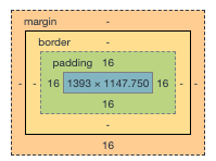
HTML元素从里到外包裹着padding, border, margin。默认在设置这些padding, border, margin之后,会在原来的元素外面扩张导致元素总体面积变大,如果希望保持元素总体面积不变,可以设置box-sizing: ```css
- { -webkit-box-sizing: border-box; -moz-box-sizing: border-box; box-sizing: border-box; } ```
- clearfix float属性的元素如果和在同一行的元素高度不一样,下边界会不对齐,可以通过设置下面属性解决:
.clearfix { overflow: auto; } - media query 响应式设计可以帮助网站内容在不同的设备上(比如手机,桌面站点)用不同的样式进行展示。
- meta viewport另一种响应式设计的方法。
- three-column可以帮助完成三列垂直布局。
.three-column { padding: 1em; -moz-column-count: 3; -moz-column-gap: 1em; -webkit-column-count: 3; -webkit-column-gap: 1em; column-count: 3; column-gap: 1em; } - More about flexbox
- CSS frameworks